in-House
in-House is a desktop app that provides user ability to rate, comment, and share the company they work for annomously. In-House provides an anonymous platform for verified employees to rate and discuss company matters. Users create security questions to access their company's page and give feedback across various categories. All feedback is subject to team voting to build consensus and ensure accuracy.
Role:
Lead UI Designer
Client:
in-house.com
Year of Production:
2023

Project - Handoff
I was brought on board to take over a project that was originally handled by a previous design team. However, the previous system was not scaleable due to the nature of it being a start-up.
- The design system was not fully built.
- The previous designer who was involved had already left, and I had to pick it up in a short time.
- Some components were inconsistent, duplicated, and missing.
Product - A High Bounce Rate
We had a high bounce rate from the current product.
- Design - The first version of MVP has strong contrast.
- Product functionality - user being blocked by the mink (insider question), where we had high bounce rate. The post page function is not complete.
- Developeres - there were 7 breakpoints for the current product, the dev team doesn’t have components built.
Project Goal
Redesign the Product
- Design system - Atomic design system that will help dev to work faster.
- Responsive - use mobile, tablet, and desktop, 3 breakpoints to shorten the design/ dev process.
- UI - change the color to be less contrast but still follow the WCAG guide.
- Product - A feature to solve bounce rate, and complete the post page feature.
Business Goal
Engage the User and create an Efficient Work Process
Following the launch of our MVP in January, we experienced a high bounce rate, and user engagement was low. Our product is centered around providing a platform for users to express themselves, and as such, we have consulted with stakeholders and our product owner to devise strategies to encourage insider activity and redesign/clean the design system.
- Resolve the high bounce rate issue with a new feature to engage none insiders
- Adding post reply(comment) function to help user interaction.
- Clean up/ Redesign the current design system.
Users & Audience
Tech, Frontline, and Progressive Orgs
From our research, we are targeting high-tech rebels (activist engineers), distressed essential (low-wage frontline), and progressive organs (startups, non-profit).

Design Challenge
Update the Design System, Components & Release the New Version
Project scope and requirements are as below
- New design system in atomic system.
- New features and pages.
- Rewrite UI rule book
- Landing page update according to new designs
- Redesign UI scheme that helps users to understand different levels of content importance, such as visual hierarchy, color contrast, and design consistency.
- Hand off to dev
- Help QA
My Role
As the UI Design Lead, I collaborated closely with the Product Owner, Junior Designer, and Tech Leads. During the implementation phase, I provided firm guidance to two developers and two QA professionals to ensure successful project delivery. I also led the design team, managing their workflow to meet deadlines and maintain a consistent pace that was at least two weeks ahead of the development team. Throughout the development process, I oversaw all stages, including product strategy, branding, user flow, Hi-fi mockup creation, and project management. By taking full ownership of the product, I ensured that it was launched on schedule.
Key Deliverables
A number of deliverables were required for the project, including:
- New design system
- V2 MVP
- Rewrite UI rule book
- Branding
- User flow
- High-fi mockups
- Feature graphic


︎
Developing process
The developing process ran through 3 phases within 3 months:
- Discover / 1 Week
︎︎︎ Understand the current product problem (user flow, feature) ︎︎︎ Competitive Analysis
- Define / 4 Weeks
︎︎︎ UAT test/ target audience
︎︎︎ Workshop possible solutions
︎︎︎ Define design system
- Delivery / 8 Weeks
︎︎︎ Engineer execution - Build design components
︎︎︎ QA - Ensure shipping features with a high-quality bar
Discover
Competitive Analysis

1. Target Audience:
Fishbowl primarily targets professionals in industries such as consulting, finance, and tech, while Blind caters to a broader range of professionals across various industries.
2. User Interface and Experience:
Fishbowl's user interface is user-friendly and intuitive, with a clean and modern design. Blind's user interface is also user-friendly, but it is more minimalistic in design, and it focuses on providing a distraction-free experience.
3. Anonymity:
Both Fishbowl and Blind allow users to remain anonymous. However, Blind has a stronger emphasis on anonymity, as it is a core feature of the platform. Blind allows users to communicate without revealing their identities, which can be beneficial in certain situations. Fishbowl allows users to create a pseudonymous profile, but it still requires users to provide their real name and company.
4. Features:
Fishbowl offers a range of features, such as the ability to create or join interest-based groups, share knowledge, ask questions, and network with other professionals. Blind provides similar features but also includes the ability to post anonymously, which sets it apart from Fishbowl.
5. Community:
Both platforms foster a sense of community and offer a space for professionals to connect and engage with one another. However, Fishbowl has a more established community and a larger user base, while Blind is a newer platform that is still growing.
6. Monetization:
Fishbowl generates revenue by charging companies to sponsor or advertise on the platform. Blind does not currently generate revenue and has yet to implement any monetization strategies.
Problems
There’s two problems needs to be tackle at the same time
- Old design system - Inconsistent user experiences, confusion, and difficulties in maintaining and updating the product. To list a few issues below: naming in the component library is not consistent, margin/ spacing is not consistent, typography is not responsive...
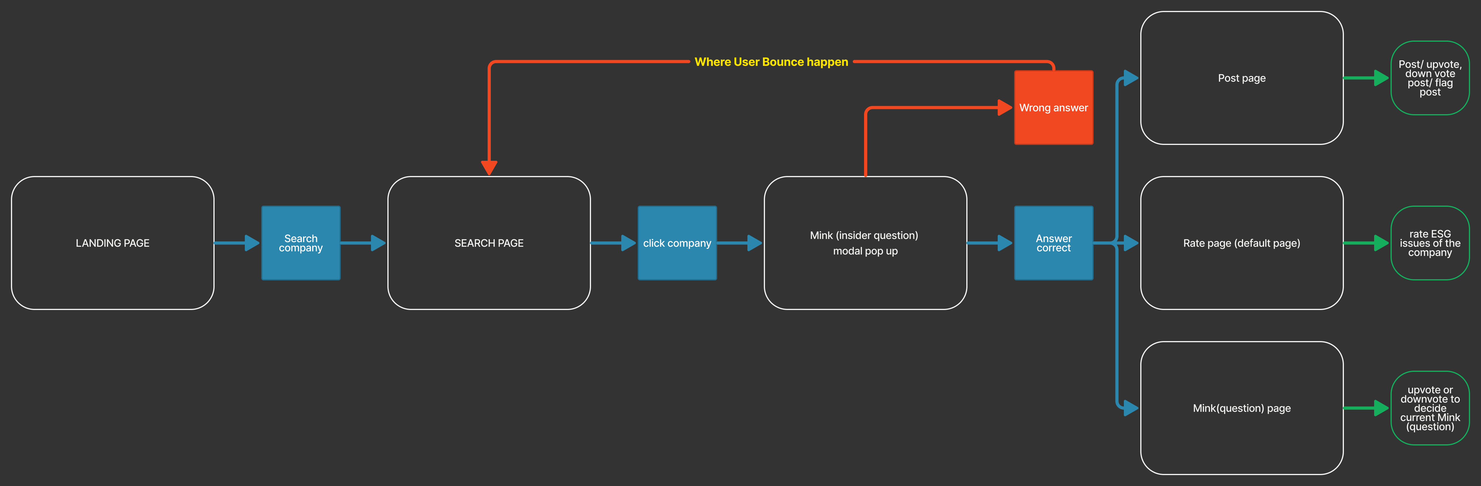
- Old product user flow - We had two different user journeys - one for insiders and one for non-insiders (depending on whether they knew about insider information). For non-insiders, the journey ended when they clicked on a company card and saw the question popup. Insiders, on the other hand, could rate and post content, but the product was lacking in features for this group.
︎︎︎Asking first time user to verify as an insider is confusing.
︎︎︎looping user back to search page give user nothing to see.
︎︎︎lack of interaction in the post section, user can’t interact with each other.
Old user flow:
Define
After the discussion with the product owner and team, we did workshop to explore possible solutions and came up with the solutions for the old flow problems:
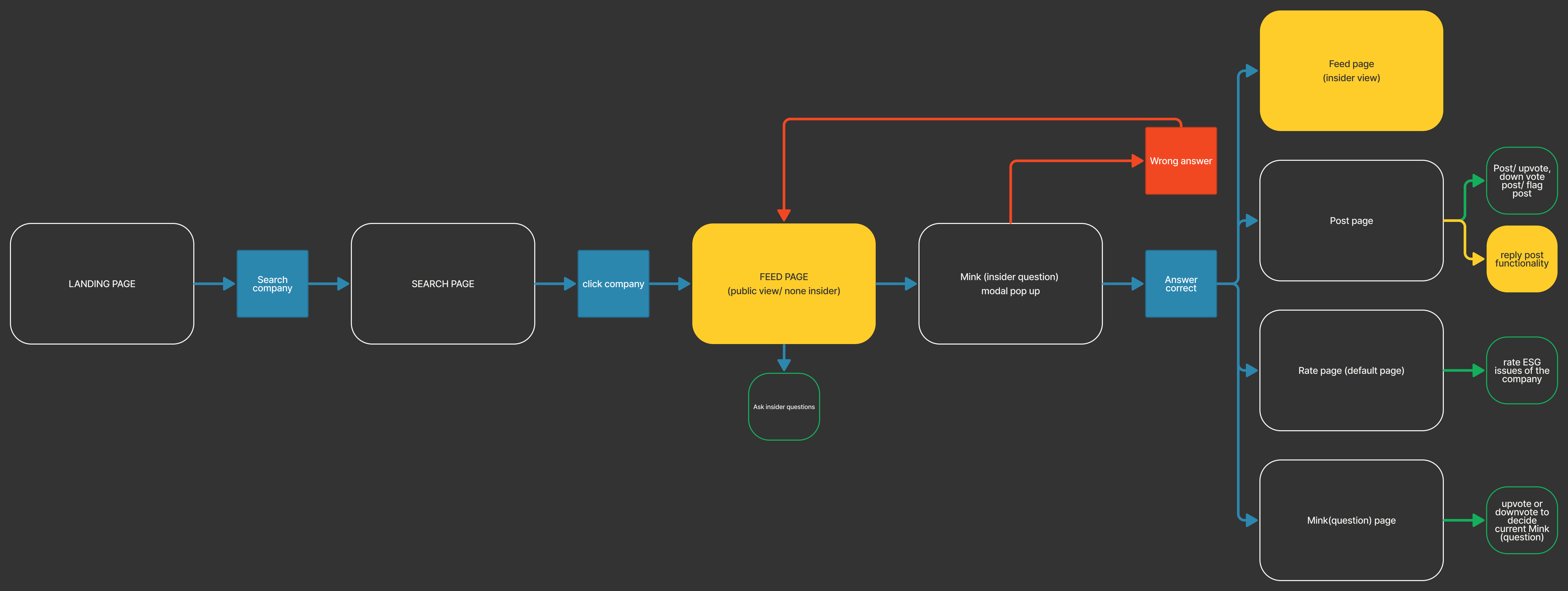
New user flow:
Solution in New User Flow
After the discussion with the product owner and team, we did workshop to explore possible solutions and came up with the solutions for the old flow problems:
- Feed page to host none insider, and allow them to ask questions. So they will stay on the page to interact.
- Adding a comment feature to allow insider to reply in the post.
New user flow:
Solution in Design System
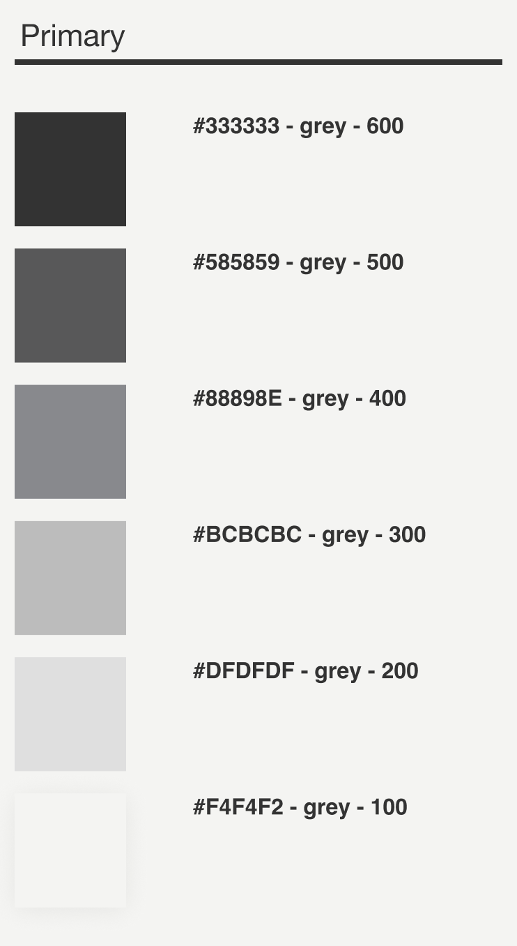
After the discussion with the product owner, we need to recreate a Atomic design system and a rule for future designer to follow:
- New design system: atomic system to create consistent and scalable digital products by breaking down interfaces into modular components.
- 4pt grid spacing system
- We’ve create the new design system and helped dev team to transition, the system is in the following layers: Token(atom) ︎︎︎ Molecules ︎︎︎ Organisms ︎︎︎ Pages
- Reduce responsive breakpoints from 7 to 3
- Adjust the Primary color to be less contrast but still follow WCAG standard
- Create new UI rule book to anchor the rules
- Clean up all the component library about autolayout, naming and maintain it.


︎ Organ level components:


︎
Delivery
Because of the natural of fast pace in start up and short timeline for design execution, wireframes and low-fi mockups were’t required. We were simultaneously finding solutions while designing hi-fi mockups. Although for the demestration purpose I created a simple wireframe with hi-fi mockups that will help stack holder to understand the product before it’s build.
Solution
Because of the natural of fast pace in start up and short timeline for design execution, wireframes and low-fi mockups were’t required. We were simultaneously finding solutions while designing hi-fi mockups. Although for the demestration purpose I created a simple wireframe with hi-fi mockups that will help stack holder to understand the product before it’s build.
Old & New Comparison
Because of the natural of fast pace in start up and short timeline for design execution, wireframes and low-fi mockups were’t required. We were simultaneously finding solutions while designing hi-fi mockups. Although for the demestration purpose I created a simple wireframe with hi-fi mockups that will help stack holder to understand the product before it’s build. (we are a mobile first web based product, I am only showing desktop view below. But feel free to go to the product itself to see the mobile responsive v.)
Because of the natural of fast pace in start up and short timeline for design execution, wireframes and low-fi mockups were’t required. We were simultaneously finding solutions while designing hi-fi mockups. Although for the demestration purpose I created a simple wireframe with hi-fi mockups that will help stack holder to understand the product before it’s build. (we are a mobile first web based product, I am only showing desktop view below. But feel free to go to the product itself to see the mobile responsive v.)
︎ Responsive - breakpoints from 7 to 3
Old
![]()
Visual problems:
Extra works for devs
New
![]()
Visual solution:
Use most common 3 breakpoints for mobile, tablet and desktop using fewer breakpoints can help ensure that your design remains consistent across different devices, which can lead to a more seamless user experience.
︎ Landing Page - color scheme and UX issues
Old
![]()
![]()


Visual problems:
- Big contrast in color scheme will cause visual fatigue, lack of visual hierarchy. But most important is reduced fidelity.
- Content imgs are in V1 design.
UX problems:
- Some of the user feel scare about the product.
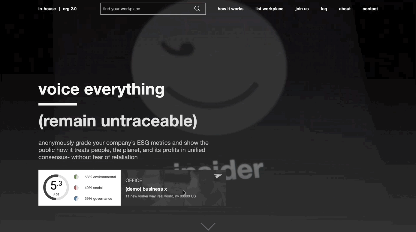
New
![]()
![]()


Visual solution:
- Adjust the primary color to make it less contrast.
- I used ai to generate images and update the product img to v2
UX solution:
Adding the demo profile card to replace the “try me!” CTA button. This will give user more transparent feelin
Old
![]()
New
![]()

Old
![]()

UX problem:
- User encountered a barrier at this point and quickly left without further engagement creates high bounce rate.
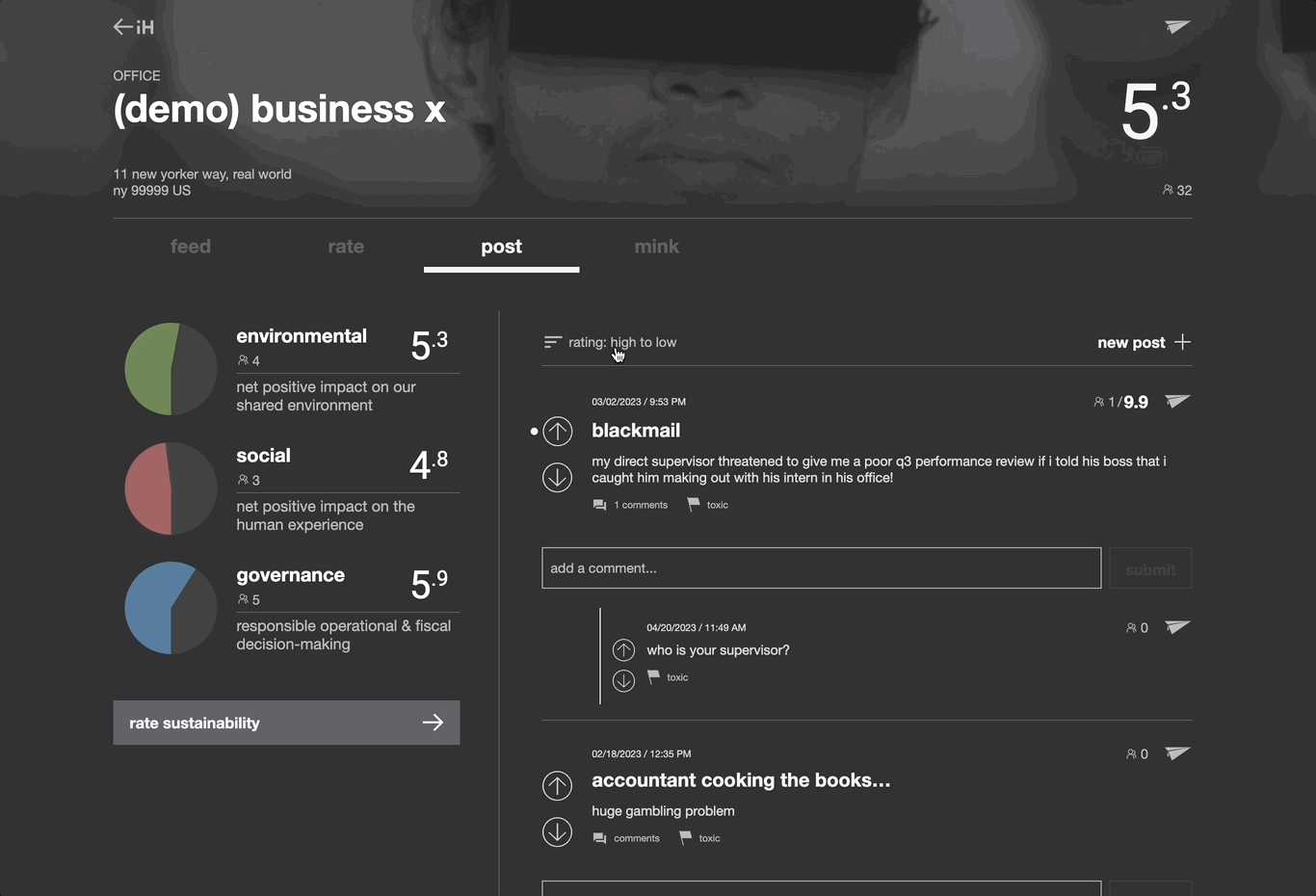
New
![]()
![]()

UX solution:
- Add a feed page to bridge none insider to see the overview of the company.
- Insider feed page is different from public view, and they are encourage to interact with none insider with replies
- Add a “ask community” button for none insider to interact with insiders.
︎ Post Page - enhance the engaging of insiders
Old


Visual problems:
- Strong contrast
- Header too heavy
- Elements feels unsettle
UX problem:
- User unable to reply to post, everytime user needs to reply creates a new post that lead to huge amount of post.
- Unable to find the post
New
![]()
![]()
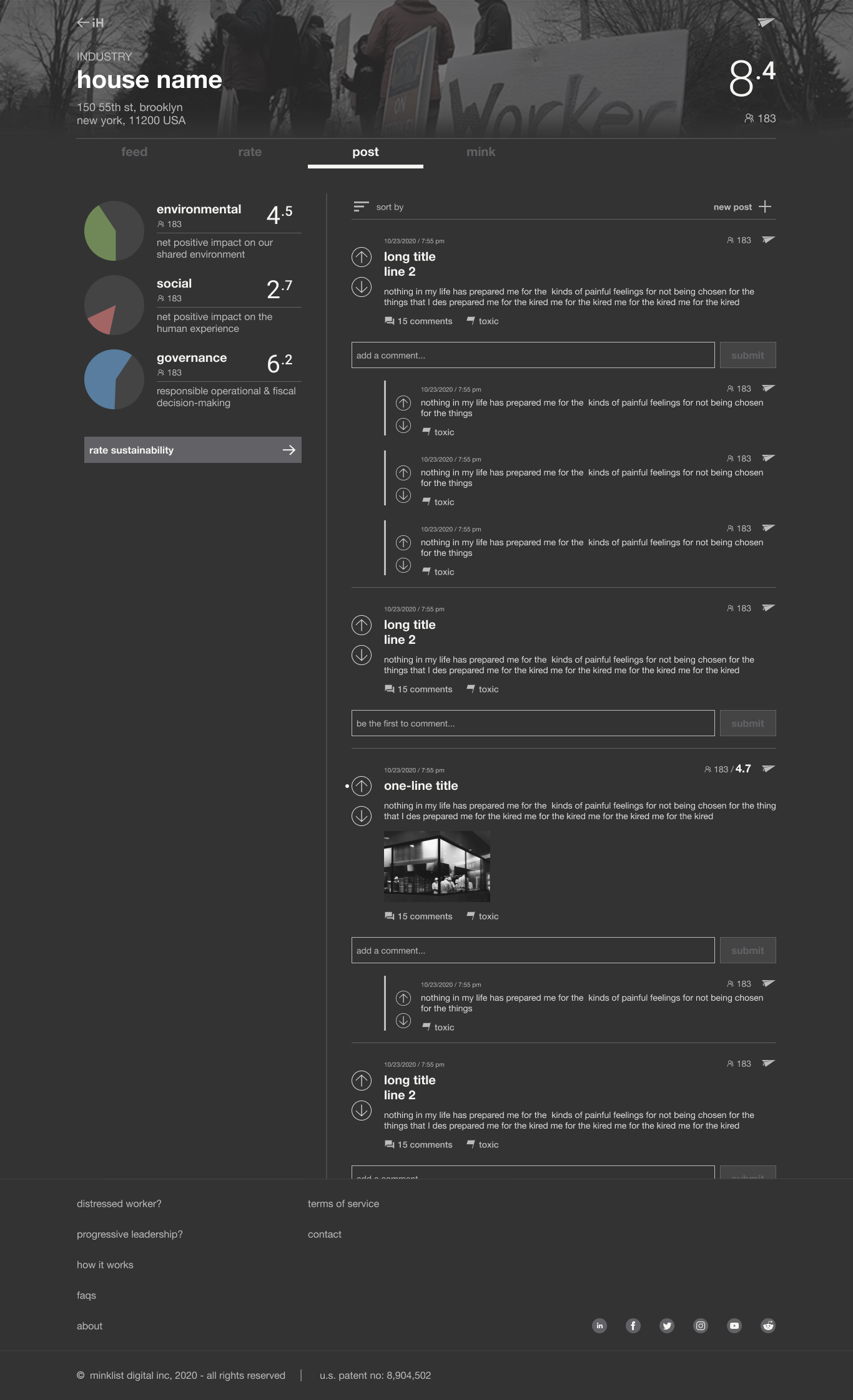
Visual solution:
- Adjust the primary color to make it less contrast.
- Change the header spacing and keep it tighter.
- New layout to balance the design.
UX solution:
- Add comments button and comment dialogue box to encourage user to reply
- Add sort button to enable user to sort post
︎ Tooltips - help user to learn some of our patented terminology
To cater to distinct user behaviors on mobile and desktop platforms, we have implemented specific features. On mobile, we have incorporated a tooltip button for clicks, while on desktop, we have utilized the mouse hover behavior. This ensures an optimized and intuitive user experience based on the respective device.


︎ Hi - Fi prototype - help marketing team, Dev and QA to handoff

︎
New UX/UI implemeted
Boosted user conversion rate
Our product has achieved an impressive click-through rate of nearly 90% to the Twitter Global Workforce page, accompanied by a remarkable conversion rate of almost 40% upon arrival.
Lessons Learned
- By leveraging my experience, I now understand the value of starting with a design guide before diving into the actual UI development. This approach minimizes back and forth, resulting in a more efficient design process.
- To enhance the inclusivity of sizing in our responsive design, we can consider adjusting the breakpoints. Currently, we are utilizing 1366px for desktop, but I believe we can potentially use 1280px or even smaller as an alternative breakpoint. This adjustment would allow for a broader range of devices to comfortably access our interface.
What We can Improve
The current product still lack of function to interact with users. Below are the next steps we can take:
- Add a poll function.
- Add a new function that user can interact with other company.
- Add a blog page to share news about workers.