Janus Film booking App
Janus Film booking App
Janus Theater is a movie theater chain with locations in New York and looking to expand to other cities in the future. It aims to provide variety films for movie lovers. Their ticket price is $18 for adult, $15 for child and senior. The theater is modern, clean, comfortable and feature a variety of films from international. They offer both online purchase and physical ticket booth at the theater. My task for this project is to design a mobile app
that can enhance the eperience of users.
that can enhance the eperience of users.
UX/UI Designer
Janus Theater
2019
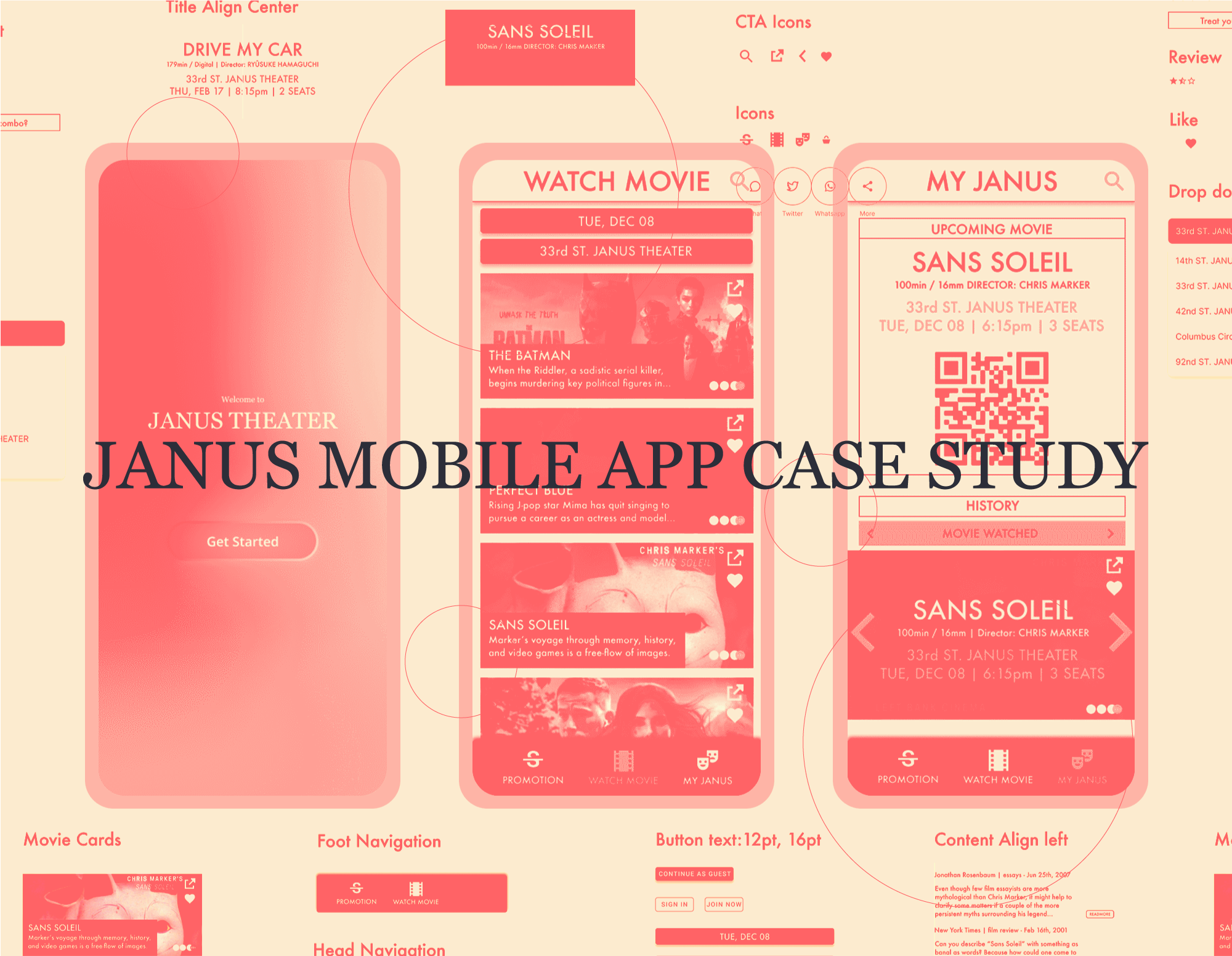
Overview:
As part of my responsibilities, I am developing a Janus Theater ticketing application with a goal to enhance user engagement. After conducting thorough research, I observed that our rivals are providing exclusive mobile applications to their clientele, and they have achieved considerable triumph. Consequently, I aim to build a cutting-edge product that can effectively compete in the marketplace, boost revenue, and elevate customer contentment.
Key deliverables:
A number of deliverables were required for the project, including:
A number of deliverables were required for the project, including:
- Branding
- User flow
- Prototype
- High-fi mockups
- Feature graphic
Challenge:
1). Designing a user-friendly interface: The challenge lies in creating a design that is both aesthetically pleasing and easy to navigate, while providing all the necessary features to book tickets and select seats quickly.
2). Providing a seamless and intuitive mobile experience to avoid a bad movie experience: In order to prevent a bad movie experience for users, it is essential to provide a seamless and intuitive mobile experience. This includes ensuring that the application is compatible with various mobile platforms and devices and providing features that enable users to easily access additional movie information such as reviews, ratings, and trailers. Implementing features like real-time seating charts and alerts for sold-out shows can also help users avoid disappointment and frustration.
3). Providing personalized recommendations: To enhance user engagement, providing personalized recommendations to users based on their past bookings or preferences can be highly effective. A crucial feature for enhancing user engagement is providing a seamless way for users to share movie information with friends and family. This can include sharing movie showtimes, trailers, reviews, and recommendations.
Problem Statement:
Users are looking for a convenient way to purchase movie tickets and a high-quality movie experience, but they often find existing products difficult to navigate. The mobile ticket purchasing process and the seating arrangements in theaters can negatively impact the movie experience, leading to frustration and disappointment.
With so many features available, it's important to consider what users truly need and prioritize those features accordingly. To start my design process, I ask myself some questions. Who are our competitors? What’s the brand image? Who are the target audiences/ users? What can I improve in the current market? What is the advantage of the platform? What do users need the most?
Design Process:
![]()

Competitive Audit Report:
![]()
What: The movie theater industry is not a new field. There’s already many signature brands.
I compare the purchasing experience of each competitor’s app as a solo user or group order.
Who: Our key competitors are Alamo, a movie theater chain with variety options of food. AMC Theatres and REGAL are the two biggest movie theater chain; Atom, an online movie ticket service that sells tickets can be used in different theaters; Alamo is a direct competitor to Janus theater. AMC Theatres and Atom are indirect competitors to Janus theater.

Gaps & Oppotunities:
The majority features of them were similiar, however I found the oppotunities after the the comparison.
- Simplify ticket purchasing user flow
- Provide seat diagram and seat rating system
- Provide features with easier navigation
The majority features of them were similiar, however I found the oppotunities after the the comparison.
- Simplify ticket purchasing user flow
- Provide seat diagram and seat rating system
- Provide features with easier navigation
Understand User’s Needs:
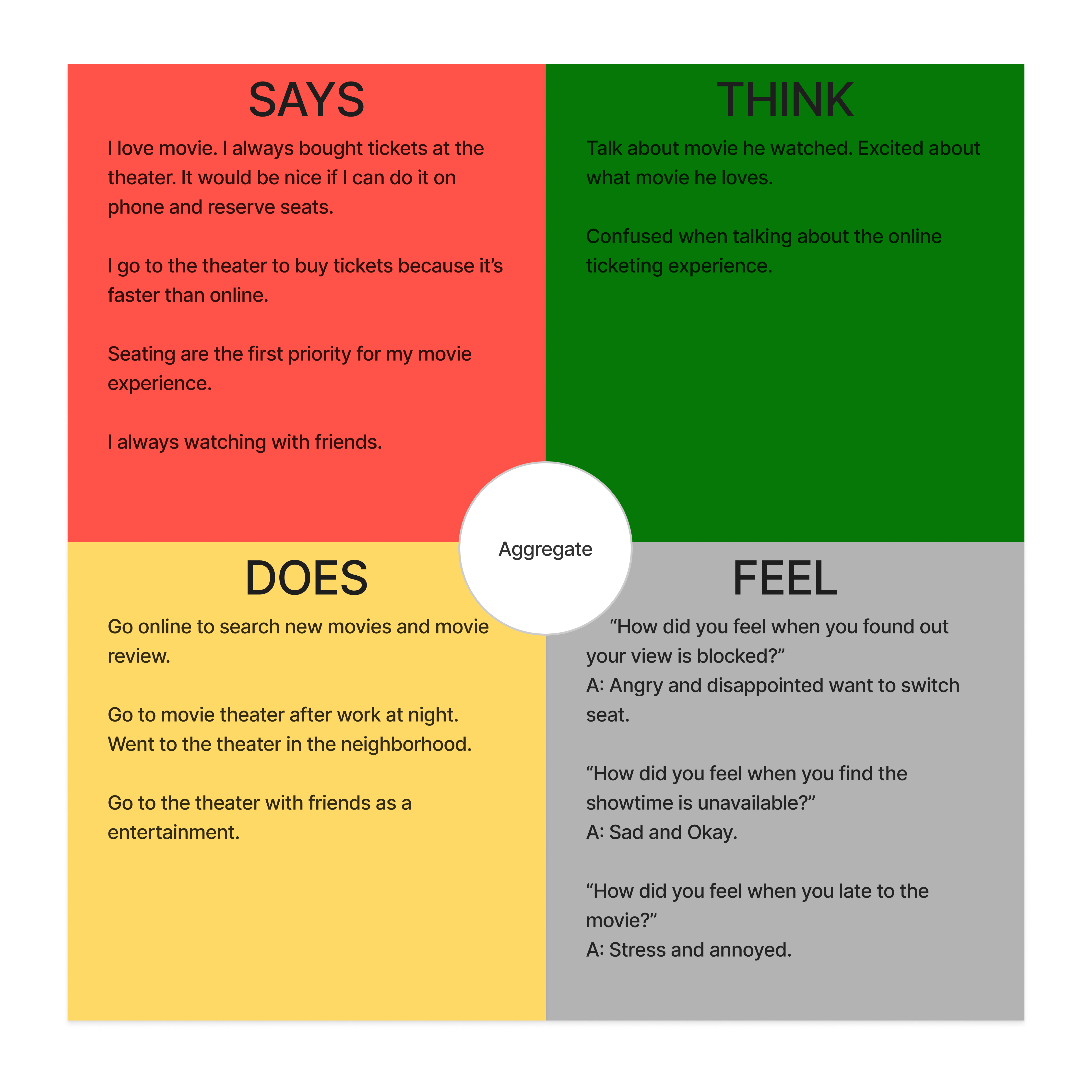
To initiate the research process, I found it most valuable to gain an understanding of the users first. I conducted user interviews to comprehend their pain points, and utilized empathy and affinity mapping to organize the collected data and generate possible solutions. This process enabled me to gain insights into user behaviors based on their responses, allowing for a more user-centric approach in developing solutions.
To initiate the research process, I found it most valuable to gain an understanding of the users first. I conducted user interviews to comprehend their pain points, and utilized empathy and affinity mapping to organize the collected data and generate possible solutions. This process enabled me to gain insights into user behaviors based on their responses, allowing for a more user-centric approach in developing solutions.
User Interview:
Duration: 15-30 min
Interviewee: A group of 10 individuals who are avid movie-goers and attend movies at least once a month.
Duration: 15-30 min
Interviewee: A group of 10 individuals who are avid movie-goers and attend movies at least once a month.
Opportunities
1. Discover opportunities to improve the mobile ticket purchasing process.
2. Identify pain points and frustrations that need to be addressed.
1. Discover opportunities to improve the mobile ticket purchasing process.
2. Identify pain points and frustrations that need to be addressed.
Empathy Map & Affinity Map:

Pain points
Bad seating with bad angle Missed movie showtime
Lose track of interested moviesTicket price too expensive
Difficult sharing movie infoProcess of ticket purchasing too complicatedDon’t know what to watch
Bad seating with bad angle Missed movie showtime
Lose track of interested moviesTicket price too expensive
Difficult sharing movie infoProcess of ticket purchasing too complicatedDon’t know what to watch
Opportunity
Create a seat rating system
Notification
User profile (watched movie, want to watch)
Avoid hidden fee, promotion
Create share buttons
Simplify the ticket purchasing process
Movie recommend (critic, review)
Create a seat rating system
Notification
User profile (watched movie, want to watch)
Avoid hidden fee, promotion
Create share buttons
Simplify the ticket purchasing process
Movie recommend (critic, review)
Ideation the Possible Solutions:
Q&A with stakeholders, user interviews, user research, affinity map, personas, and competition research.
The method above leads to the result below:
I used “How might we” to ideate the problem.
“How might we enhance the movie experience from begining to end?”
Possible Solution:
Q&A with stakeholders, user interviews, user research, affinity map, personas, and competition research.
The method above leads to the result below:
I used “How might we” to ideate the problem.
“How might we enhance the movie experience from begining to end?”
Possible Solution:
-
Simplify the ticket purchasing process to enhance the experience
-
Share button to help user’s need
-
A seat rating system to avoid bad seating to optimize the movie experience
-
Critic and review feature to engage users and help them pick movies
-
A promotion page for user to get cheaper tickets
-
Notification before showtime
- A personal profile to document watched movie and movie want to watch
Features that Solve the Problems:
Among all the solutions above, the first priority would be ticket purchasing process optimization. Most of the process involves six pages, my goal is to match or simplify the process. Create more intuitive navigation. I optimized the process into four pages and created a User task.
Among all the solutions above, the first priority would be ticket purchasing process optimization. Most of the process involves six pages, my goal is to match or simplify the process. Create more intuitive navigation. I optimized the process into four pages and created a User task.

User task:
From open app to finish purchasing ticket.
Open App >
1). Homepage (time, place and movie select) >
2). Movie page (showtime) >
3). Seating page (seating, ticket type and add-ons) >
4). Order Review (member or email, payment, promotion)
> Order
From open app to finish purchasing ticket.
Open App >
1). Homepage (time, place and movie select) >
2). Movie page (showtime) >
3). Seating page (seating, ticket type and add-ons) >
4). Order Review (member or email, payment, promotion)
> Order
Next, I want to focus on what possible features will be solution. After laying down all the possible features can help us create a better User Flows.
So what features to bring in to enhance user experience?
So what features to bring in to enhance user experience?
- Bad Seating - Seat rating system included (seat diagram, seat rates, seat rating after movie)
- Difficult to share informations - Social share button included (share button for movie)
- Difficult to search for movie information and keep track - Movie critics, Movie history included (movie critics, favorite movie button/ section, watched movie section)
- Expensive movie ticket - Promotion included (monthly membership, discount tickets, transparent service fee at check out)
User Flows:
With the key features layout that helps the creation of user flows. By architect out the tasks one by one to avoid messing up with the navigation and hierarchy.
With the key features layout that helps the creation of user flows. By architect out the tasks one by one to avoid messing up with the navigation and hierarchy.

Wireframe and Prototype:
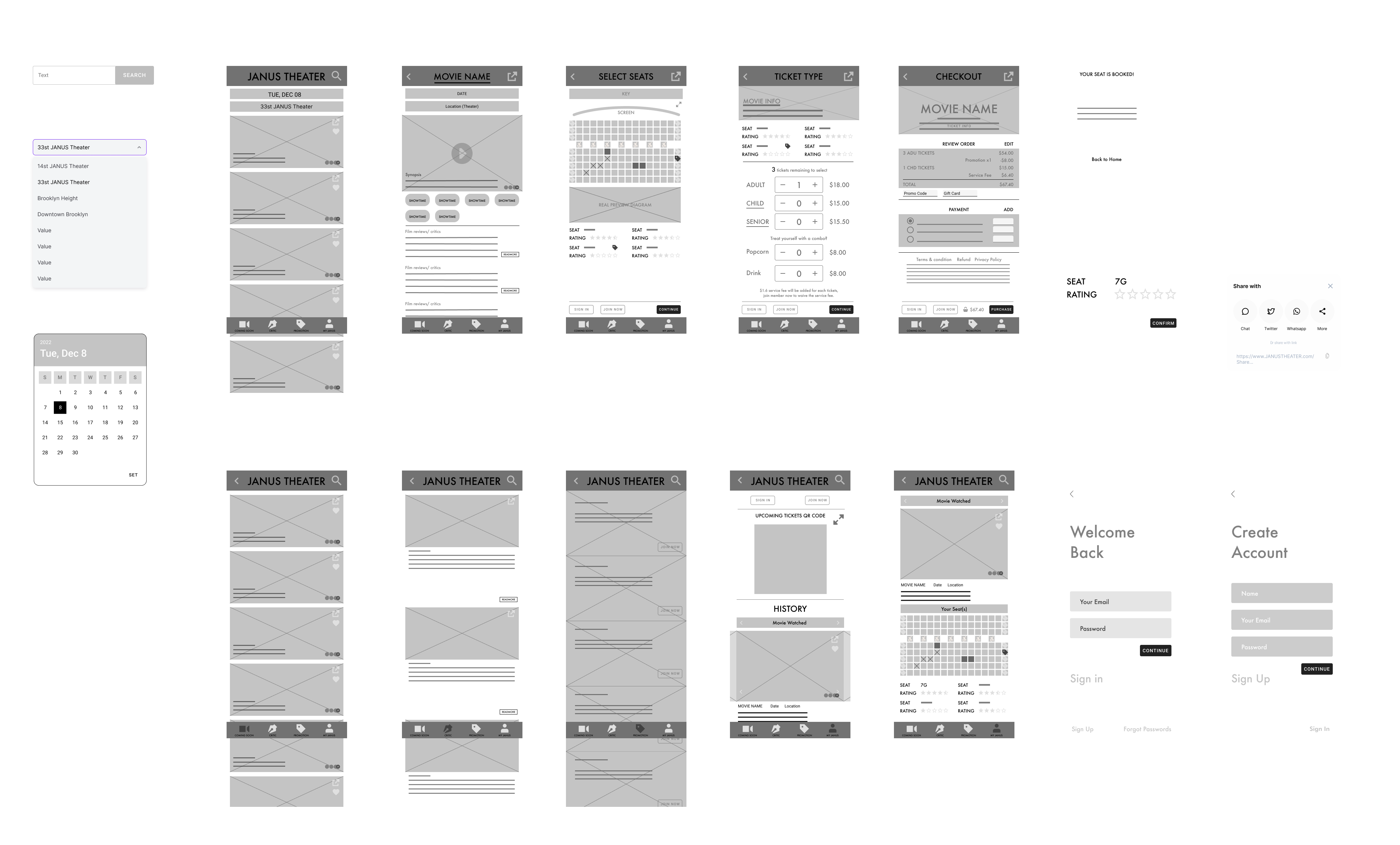
After some sketches on paper, I jump into Figma and create the wireframe according to the User Flows. “Designing the easiest and intuitive user interface by creating the right user flow.” I created the first prototype and am ready to do the Iterations & User Testing next.
![]()
![]()
After some sketches on paper, I jump into Figma and create the wireframe according to the User Flows. “Designing the easiest and intuitive user interface by creating the right user flow.” I created the first prototype and am ready to do the Iterations & User Testing next.

(clickable)
Iterations, User Testing & Prioritized Insight:
I ran a usability study with 10 users. The goal of the user testing is to find out if users were able to purchase a movie ticket on the low-fi prototype smoothly. Participants were ask questions below:
I analyze the result and came up with the theme below:
Users want to purchase tickets faster
10 out of 10 participants want to purchase the ticket in under five mins.
6 out of 10 participants found the user flow to be easy.
Users want the more useable seat rating system
10 out of 10 participants found the rating system useful.
3 out of 10 participants found the user flow to be easy.
Users find some features are redundant
10 out of 10 participants found the share function useful.
6 out of 10 participants found the coming soon page not useful.
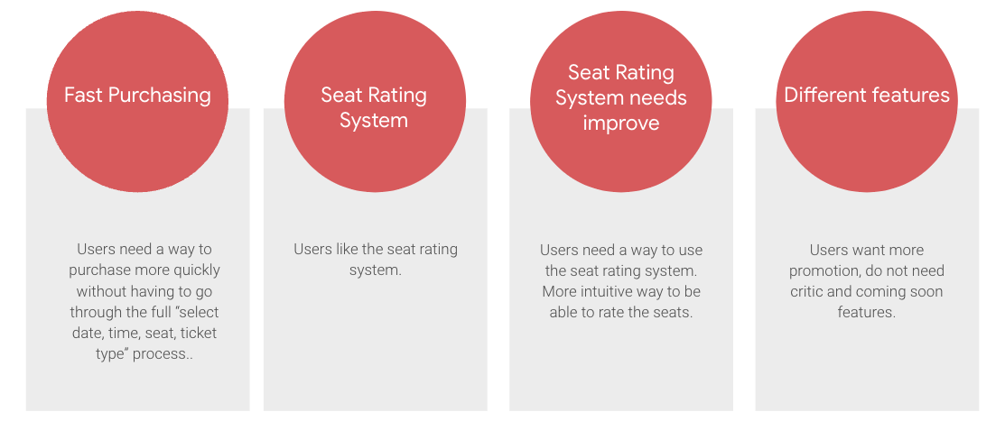
Research insights:
![]()
Prioritized insight:
“After prioritized insights the stack holder decided that I should work on improve seat rating system and remove not popular features.”
I ran a usability study with 10 users. The goal of the user testing is to find out if users were able to purchase a movie ticket on the low-fi prototype smoothly. Participants were ask questions below:
- How long does it take a user to purchase a ticket?
- Do people find the seat rating function useful?
- Does the rating of the seat affect the will of watching a movie?
- In what steps users left the ticket without checking out?
I analyze the result and came up with the theme below:
Users want to purchase tickets faster
10 out of 10 participants want to purchase the ticket in under five mins.
6 out of 10 participants found the user flow to be easy.
Users want the more useable seat rating system
10 out of 10 participants found the rating system useful.
3 out of 10 participants found the user flow to be easy.
Users find some features are redundant
10 out of 10 participants found the share function useful.
6 out of 10 participants found the coming soon page not useful.
6 out of 10 participants found the critic page not useful.
3 out of 10 participants suggested emphasis more on promotion.Research insights:
Prioritized insight:
“After prioritized insights the stack holder decided that I should work on improve seat rating system and remove not popular features.”
The iteration from the Insight:
Iteration 1. Seamless and Faster Process (simplify features, less steps)
I streamlined the navigation process by consolidating pages and eliminating unpopular categories from the main buttons. As a result, the movie page became the primary destination for users, reducing the number of steps required to complete a task from 8 to 6.
I streamlined the navigation process by consolidating pages and eliminating unpopular categories from the main buttons. As a result, the movie page became the primary destination for users, reducing the number of steps required to complete a task from 8 to 6.
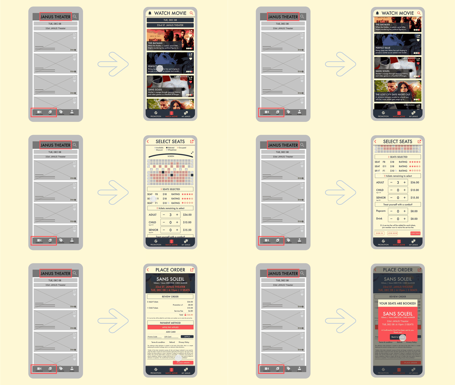
Iteration 2. A Better Movie Experience (Seat Rating System)
Recreate the seat rating system inside the archive section.
Recreate the seat rating system inside the archive section.

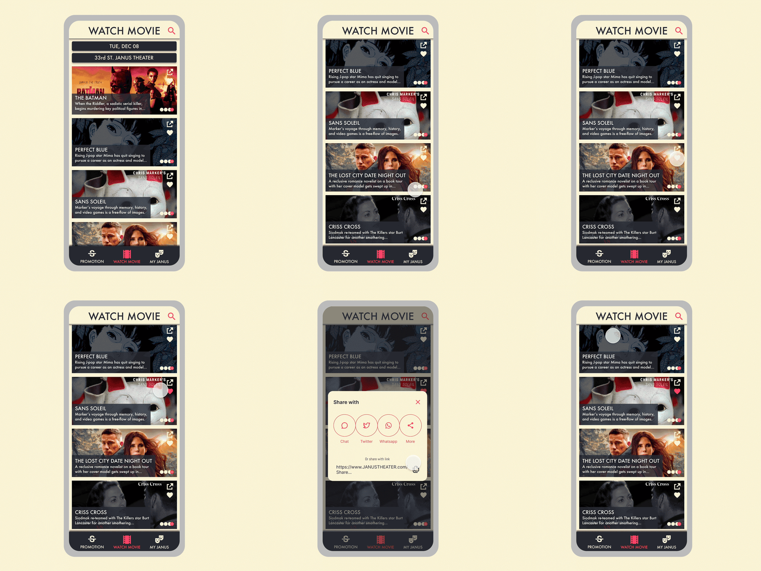
Iteration 3. Customer Stickiness & Brand Royalty (through features)
Different features that enhance the experience.
“Showtime notification”, “favorite movie button” and “share movie button” to fill the gap in user journey.
Different features that enhance the experience.
“Showtime notification”, “favorite movie button” and “share movie button” to fill the gap in user journey.

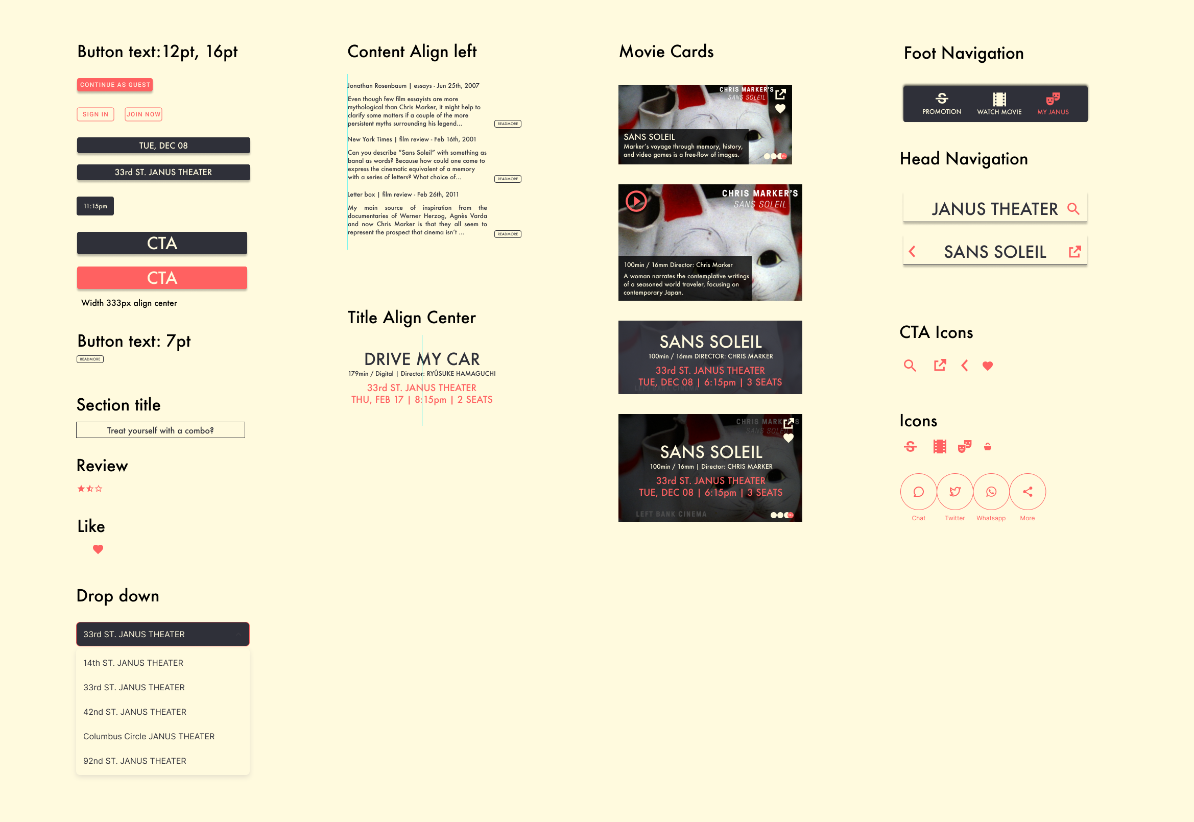
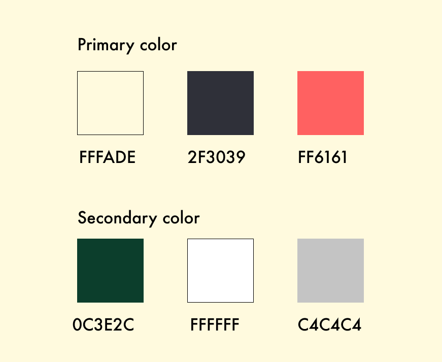
Style Guide:
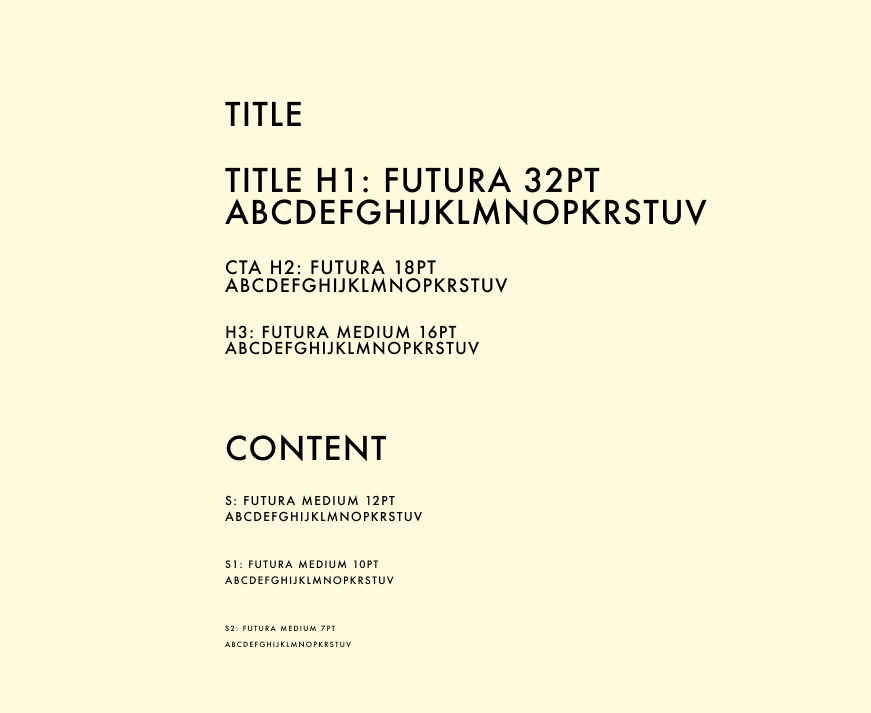
The Hi-Fi Prototype:(clickable)
Takeaways:
I fixed the most critical problems in the first phase. After sharing the hi-fi prototype result with the stakeholders and team, I started to make a plan for phase 2. In the next phase, I will focus on more unique features such as a quick order ticket button that only need to select date, place, and time. A competitor theater comparison section. A better seat diagram. A rating system covers comfortability, sound, view...etc
I fixed the most critical problems in the first phase. After sharing the hi-fi prototype result with the stakeholders and team, I started to make a plan for phase 2. In the next phase, I will focus on more unique features such as a quick order ticket button that only need to select date, place, and time. A competitor theater comparison section. A better seat diagram. A rating system covers comfortability, sound, view...etc